
Define with CSS the appearance of the sensor graphics web in the IoT
In the previous article in the series on how to make state graphs of sensors connected to the Internet of Things IoT explains the way use a web page developed in HTML as a structure for graphics. The web page elements, which had been reduced to a minimum using objects <div>, did not directly define its appearance, instead, they referred to the appearance information to a style sheet CSS, which is what is going to be explained in this part of the series.


In the solution that I propose to make graphs of sensors connected to the IoT, a document is used CSS that is loaded from the document HTML. If the code HTML will be generated from an application on the server, for example in PHP, it would be very simple to include it as part of the code that defines the web page instead of loading it from it, which could be optimized a bit by saving a call. Whichever option is chosen, the most convenient method includes edit the code CSS in a separate document to manage it more comfortably and to be able to reuse it. In the example developed in the tutorial of this series of articles, it has been given the name estilo.css.
In the same way, When dealing with complex projects it will be advisable to use several separate style sheets in different documents, both to be able to reuse specific functionalities without having to load them all each time, and to edit the code more easily by distributing it into different documents according to the corresponding logical structure.
The styles CSS They try to describe all extremes of the behavior and appearance of a web page from several types of approaches, all simultaneously valid, while trying to respect compatibility with previous version specifications as much as possible. This means that there are many possible solutions that solve the same needs. as well as a high number of available resources (properties CSS). Due to the didactic approach of the article and so as not to confuse new users in CSS, only the properties and the structures necessary for the final objective, which is to graphically represent data from sensors connected to the Internet of Things. At the same time, there is also a small introduction to CSS, cascading style sheets.
Formatting CSS properties
El basic format It consists of a property name, the colon sign, the property value, and the semicolon sign. nombre:valor;
CSS allows you to use different units of measurement in the same document including those related to the structure (the measurement of what an element contains) as percentages, relative to the device on which they are represented, such as the pixel, or absolute such as centimeters. The units are expressed after the value according to the following abbreviation coding.
| Custom code | Unit |
| % | container percentage |
| ch | relative to the width of the number zero |
| cm | centimeters |
| em | relative to the base type of the container |
| ex | relative to the height of the letter x |
| in | inches |
| mm | millimeters |
| pc | picas (typographic measurement) |
| pt | points (typographic) |
| px | pixels |
| rem | relative to the base type of the document |
| vh | relative to 1% of eye height (mobile screen) |
| max | relative to 1% of the largest dimension of the view (mobile screen) |
| in min | relative to 1% of the smallest dimension of the view (mobile screen) |
| vw | relative to 1% of view width (mobile screen) |
For the application that we are going to do, it is important to consider at least three style units. The % for taking measurements relative to the size of an item's container, the pixel for measurements according to the resolution of the screen and the millimeters (actually, any absolute measurement) for making printed reports.
There is some complex properties, or composite, which depend on several values (such as color, size, style...), to indicate the value there are two possibilities in CSS: write, in the appropriate order, all the values separated by spaces or use the sum of simple properties equivalent to the complex. For example, all four margins of an object can be specified in a single property margin or can be set with properties margin-top, margin-right, margin-bottom y margin-left. By the way, that order (clockwise) is the one followed by the descriptions of values that "surround" an element such as the inner (padding) or outer margin, the border...
With what has been explained so far we can now see some examples of properties
| 1 2 3 4 | margin:10px 20px 0 10px; width:500px; height:100%; color:#FF0099; |
In the example above The color is defined using a code of 6 hexadecimal digits that represent, in pairs, the value of the red, green and blue component. When it happens, as in the example, that the two digits are equal, it can be abbreviated as #F09 (which, by the way, corresponds to the so-called "web safe colors"). In the final proposal I will avoid using these abbreviations to unify the criteria and make it more readable. You can also abbreviate the values of complex properties, such as margin in the example, when all values or opposite pairs are repeated. Along the same lines of saving text, it is also possible to omit the unit when specifying a property when the value is zero, since it is irrelevant in that case.
Some values, in addition to being able to be expressed numerically, have a name which makes the code more readable and allows you to remember them better. For example, instead of the target's hexadecimal numeric code, #FFFFFF (o #FFF), can be written white with the same result. In this way, the color black, #000000 (o #000), can be replaced by black.
As well there values are expressed by a special code, a name. For example, to indicate that the side margin is set automatically by the browser (normally it will correspond to the center function) the special value is used auto, which has no numerical correspondence with any value.
For express a special way of using a series of composite (complex) values of a property CSS You can choose formats with a syntax similar to that of the functions. For example, to express a color as the three values of its red, green, and blue component (the RGB model) would be written color: rgb(128, 255, 64);. Within this style of expression it is also possible to use units; In the example above, the color components are a decimal value from 0 to 255, but it may be easier to express this as a percentage of the total of each color component, in which case it could also be written as color: rgb(50%, 100%, 25%);.
Calculating values in CSS
In the most recent versions of CSS it is possible to do simple mathematical operations to calculate values. To do this, use calc and the operation to be performed is expressed in parentheses. You can indicate units, parentheses and simple operators such as sum (+), subtraction (-), multiplication (*) and division (/). The expression would be of the type width:calc((90%-20px)/2));.
Variables can be used in mathematical operations in CSS referring in the calculation of one property to the value of another with var. In order to be able to use a variable without needing to refer to an actual property of the style, it is also allowed to cite a property that does not exist. CSS recommends the format --nombre-variable (two hyphens in front of the name of the invented property). In this way, to define the height of an element as half its width an expression in CSS as height:calc(var(width)/2); and to define a new variable "thickness" (which other properties could use) you would write, for example, --grosor:4px; to be able to later refer to it as margin-top:calc(var(--grosor)*4);
Browser-Dependent CSS Properties
CSS It is a specification standardized by the consortium W3C (World Wide Web Consortium) but many properties or behavior styles reach browsers before being part of the specification of a version.
so that the code CSS works with the current features of a browser, but do not lose compatibility with new features, a prefix is used. This prefix depends on the rendering engine that uses the web browser you want to reference (for which the style is defined).
The prefix -webkit It works for browsers based on W as Safari o Chrome. The prefix -moz It is used for browsers based on the rendering engine de Mozilla, currently Geckoas Firefox and its derivatives. To refer to EdgeHTML, rendering engine browser Edge from Microsoft (formerly Trident), the prefix is used -ms. The case of the browser Opera is a bit special since he started using his own rendering engine, referred to with -o, but currently works with W, which is expressed as -webkit.
To use a property referring to a browser, write its name, prefixing it and separating it with a hyphen as in -o-border-radius:10px;, which would serve to set a rounded border (a rounded corner) in older versions of the browser Opera.
Comments
To clarify the code CSS You can use comments, which will make it more readable although with the disadvantage of increasing its size. The syntax of comments in CSS It's like multiline comments C++ which I'm sure you already know: starting in /* and ending in */, As in C++, can occupy several lines.
Selectors
The definition of properties are assigned to objects in a document HTML grouping them in selectors and enclosing them in braces. A selector can reference a language element HTML (a label), like div, a class (assigned with class en HTML) an identifier (assigned with id en HTML) or all (the “universal selector”) represented by the asterisk (*). The following example shows a selector of each type:
| 1 2 3 4 5 6 7 8 9 10 11 12 13 14 15 16 17 18 19 20 21 | * /* El asterisco es el selector universal */ { margin:2px 6px 4px 20px; } div /* div es una etiqueta HTML */ { width:500px; height:200px; } .grafico /* «grafico» es el nombre de una clase que se usará en HTML con class=”grafico” */ { color:#A0B0C0; } #superior /* «superior» es un identificador que se usará en HTML con id=”superior” */ { width:100%; color:#CCCCCC; } |
The labels of HTML are expressed in the style definition with their name, the classes are marked by putting a period before the name (.) and a pound sign (#) for identifiers.
Part of the great power of CSS resides in the possibility of grouping selectors when defining their properties. There are several ways to group selectors. By grouping them, separating them by commas, it is expressed that each of the cited selectors has those properties.
| 1 2 3 4 5 6 7 8 9 10 11 | .consumo, .humedad, .temperatura { color:#FF00AA; width:100%; height:100%; } .temperatura { height:50%; } |
The previous example indicates that the consumption, humidity and temperature classes share color, width and height. A new concept is also introduced in this code: properties can be redefined, and in that case the most recently described ones prevail. In this way, the elements of the temperature class would finally have a height of 50% of the object that contains them.
If the grouped selectors are not separated by commas, the condition imposed on the properties is cumulative, that is, an element must satisfy all selectors for it to acquire the appearance or behavior they define. If selectors refer to tags HTML The order in which they appear must be descending in the level of inclusion: first the highest hierarchical level and last the lowest.
| 1 2 3 4 5 6 7 8 9 10 11 | div.temperatura { color:#FF00AA; width:100%; height:100%; } .temperatura .consumo { height:50%; } |
In the previous example the elements are defined div that are also of the temperature class and the elements that have both the temperature class and the consumption class (both at the same time) as in class="temperatura consumo". The elements <div> Of code HTML with class="temperatura" they would have a high of 100%
CSS properties to define the text
A distinction can be made between three types of properties that affect the appearance of the text: (1) those that establish the font with which it is presented, (2) those that determine the appearance of the literal (the content of the text) and (3 ) generic ones, that is, those that affect both the appearance of the text and that of other components. In general, what was said to explain those of the last group will also apply to the same properties applied to other elements.
Typography (font)
-
font-familyindicates the name of the font used for an element. You can write a single name or a list, in order of preference and separating the names by commas, of the fonts that will be used alternatively if the desired one does not exist. Along the same lines, it is possible to use generic fonts with the namesmonospace,serif,sans-serif,cursive,fantasy. Of these generic fonts, the most important (for the presentation of data at hand) is the first that, as its name suggests, will use the fixed spacing font available in the system and preset by the browser. The second,serif, it will use the default one available serif (finishing or grace). Without auction if the third is indicated,sans-serif. Imitating hand drawn writing withcursive(a way of calling it that clearly could be improved) and the decorative typography of the system withfantasy, the last of the five.As for the code CSS Spaces have a special meaning as a separator; when the name of the font family is made up of several words separated by spaces, it is written between quotation marks to avoid confusion.
1font-family: DejaVu, Helvetica, Arial, “a palo seco”, sans-serif;Web browsers are capable of using local fonts (those installed on the system on which they operate) as well as others that are specifically loaded, even overlapping those installed locally. To load a font, use
@font-faceindicating its name, the download location of its definition and, if applicable, a description of its format.12345678910111213141516@font-face{font-family:“SircuitoExpandedLight”;src: url(‘/EOT/Sircuito-Expanded-Light.eot’);}@font-face{font-family:“SircuitoRegularMedium”;src: url(‘tipos/Sircuito-Regular-Medium.eot’);src: url(‘tipos/Sircuito-Regular-Medium.eot?iefix’) format(‘eot’),url(‘tipografia/Sircuito-Regular-Medium.woff’) format(‘woff’),url(‘tipografia/Sircuito-Regular-Medium.ttf’) format(‘truetype’),url(‘tipografia/Sircuito-Regular-Medium.svg#webfont’) format(‘svg’);-webkit-font-smoothing:antialiased;}In the first of the two definitions in the previous example, the letter of the document is loaded Sircuito-Expanded-Light.eot which is located in the EOT folder inside the main (root) folder and is assigned as a family name CircuitExpandedLight. By the way, do you like this font? It's free, you can download for free the Sircuito font that I designed for the GranaBot image.
As can be seen in the example, the url property, which corresponds to the uniform resource locator, allows you to specify the location of the document with the font that is downloaded. The slash is used to separate the name of the different folders from the path to the font, starting with the one containing the document from which the call is made or from the root if the URL Start with a bar.
The second example uses several alternative documents so that the same definition works for several browsers (each of which will load the type it is capable of interpreting)
The last line of the definition includes the property
font-smoothingto soften the letter (apply a antialiasing). As it is not a standard property, the prefix is used-webkit. -
font-sizeserves to indicate the size of the letter as infont-size:12px; -
font-weightSets the font thickness. It can be expressed as a numerical value, usually a multiple of 100 between 100 and 900, according to the usual typographical weights, or more frequently with a name:normalfor the base thickness,boldfor the bold,bolderfor the version usually called black,lightfor the fine (commonly called light) andlighterfor the thinnest (sometimes called thin).The numerical value of the normal version of the font is 400 (unitless) and 700 for the bold version.
By default, if no other value is indicated, the appearance of the font is the one that corresponds to
normalor 400 so, if it has not been changed in the generic element or in the container, from which it inherits, it is not necessary to indicatefont-weightwith the valuenormal. -
font-stretchIt is used to indicate the width of the letter, as long as it is available in the corresponding family. The possible values that the property can take, ordered from narrowest to widest, are:ultra-condensed,extra-condensed,condensed,semi-condensed,normal,semi-expanded,expanded,extra-expandedyultra-expanded. With the same criteria that was used in the previous property, the default width isnormaland it is not necessary to expressly indicate it unless it has been changed in a higher hierarchical order than the one being defined. -
With
font-styleYou can indicate whether a text is drawn with a slanted or oblique letter, which affects its appearance, or with a cursive letter, which expresses a special meaning (foreign words, for example), or round letter, that is, neither the previous ones or normal. the valueobliquefulfills the first function, that of appearance and valueitalicthe second. The fact that the appearance of both is frequently similar or even the same means that the use (the meaning) is sometimes confused, so it is worth paying attention. As with other properties,normalserves to deactivate the previous values. -
text-decorationserves to underline (with the valueunderline), overline (with the valueoverline), cross out (with the valueline-through) or flash (with the valueblink) the text that this property affects. -
To complete the series of the typography aspect, although for our application it is not very relevant,
font-variant, allows you to apply small caps (small capital letters) to the texts.
Text
-
text-aligntells the browser how the block of text should be aligned. The possible alignments are to the left (which is considered by default) with the codeleft, center with the valuecenter, right usingrightand justified at both ends withjustify. -
line-heightsets the separation between lines of text. In this case, if percentages are used, the value of 100% corresponds to the height of the text instead of the measurement of the container. The most used measure relative to the text corresponds to 120%. A 100% line would mean that the bottom of one line touches the top of the next. Although typography design usually includes some space, it is common to leave a little more margin between lines.To express the separation between lines, it is also possible to indicate a coefficient (a unitless value) with which to calculate the height of the line based on the height of the text box.
-
letter-spacingis the value of the space between the letters of words, which in typography is known as kerning o tracking. -
word-spacingrepresents the measure of the spaces between words. -
white-spacesets the behavior of white spaces in a text. When the value is usednormal, which is taken by default, joins several blank spaces in the code HTML in one of the presentation on the web page (displayed by the browser) and takes the white spaces as a reference to break a line if there is no space in the block.The value
nowrapIt also joins the repeated blanks into one but does not split the lines of text in the blanks even if the line does not fit in the container, overflowing the space if necessary and writing outside if necessary. To expressly divide the lines you can use the label<br>de HTML.Using
preNeither are the blank spaces unified by joining them into one, nor are the lines divided using the spaces as a reference.pre-linejoin the repeated blanks and break the lines if necessary using the blanks as a reference.pre-wrappreserves repeated whitespace and breaks lines if necessary using whitespace as a reference.
Color
En CSS color can be expressed according to RGB color model or according to HSL color model and in both cases transparency information can be included, the value of a fourth channel that is usually called alpha channel o alpha composition, which gives rise to the RGBA and HSLA models.
To express color in format RGB using hexadecimal notation the syntax is used #RRGGBB, with RR being the value of the red component (in principle, using two hexadecimal digits), GG being the value of the green component and BB being the value of the blue component. As already said, if the two digits of each component have the same value it can be expressed as #RGB limiting the number of colors available to the so-called web safe ones
In addition to this way of representing color, the most classic and used, it can be expressed as rgb(R,G,B), hsl(HSL), rgba(R,G,B,A) y hsla(HSLA) to indicate it in the format RGB, Swedish Hälso- och sjukvårdslagen and their respective forms with indication of transparency (alpha channel)
Unless otherwise requested by adding the unit suffix, the RGB model uses decimal values from 0 to 255, for the three components, the value of the alpha component is a coefficient (decimal from zero to one) and the first value of the HSL color model, the hue, is a decimal value that ranges from 0 to 360 (without units) representing an angle. The saturation and luminosity values of the HSL model They are usually expressed as percentages.
As has already been said, although its use is not very frequent, colors can be indicated by their name in the format color:black; instead of color:#000000;. The first format is more readable but is limited to a brief table of values that is also more difficult to modify numerically from an application written in JavaScript.
For our proposal for graphical representation of data from sensors connected to the IoT, we will only need three properties related to color. They will serve both to indicate the name of the text, which is now explained, and to indicate the name of any component that supports it.
-
colorindicates the color of the element HTML and that of what it contains (which inherits it) unless it is expressly changed by assigning other colors individually. -
background-colorUsed to define the background color of an element HTML. In addition to indicating color as a value RGB o Swedish Hälso- och sjukvårdslagen you can use special valuetransparentto make the object have no background color and it is possible to see what is located behind it, that is, it does not cover the elements on which it has been drawn. -
opacityallows you to set the opacity (indirectly, transparency) of an element and all its content (not to be confused with the transparency of the background). If transparency is assigned to elements contained in others that are themselves transparent, this will be increased, it will not work separately. You cannot make an object contained in another transparent one more opaque. The value ofopacityIt is expressed as a coefficient likeopacity:0.5;to indicate 50% opacity.Older versions of Microsoft's browser did not use this property, but did have the property
filter(filter) that, among other values, could support alpha (for the alpha channel) to which a percentage opacity could be assigned withopacityaccording to the format:1filter:alpha(opacity=50); /* Opacidad del 50% en una versión 8.0 o anterior de Microsoft Internet Explorer */
Measures:
En CSS, the measurement of the elements <div>, which we have chosen to compose the graphics container, is set with width (width) and height (high).
between the content of <div> and its perimeter there is a filling area that is determined with the value of padding. Surrounding the perimeter of the object is the edge whose measurement is specified with the property border. Separating the exterior of the object <div> of the other surrounding objects there is a space whose measurement is determined by margin.
Under normal conditions, the measurement of the space used by the object <div> can be calculated as the sum of its width or height plus the padding (padding) plus border (border) plus margin (margin). When the relevant measurement that is established is the useful interior space of the object <div>, this composition is very practical, but if what is known is the total measurement available can this behavior be changed, set by default, so that the total width and height measurement is the one indicated by width (width) and height (height) by subtracting the measurement of the padding, border and margin from it, instead of adding it. To use this mode, assign the your property box-sizing the value border-box (default is content-box)
The following diagram shows graphically the values resulting from width (width) and height (high) if using box-sizing:border-box; (the total) orbox-sizing:content-box; (inside)

The values of the measurements are expressed with the units that have already been explained. When it comes to properties defined by several values, figures expressed with different types of averages can be mixed. In addition, there are some special values that are relevant to the use we are going to make in this implementation of sensor graphs in the IoT. Specifically, we can use the value auto on the property margin as a resource to center objects in some circumstances.
| 1 2 3 4 5 6 7 8 9 10 11 12 13 14 15 16 17 18 | .caja_chica { box-sizing:border-box; width:400px; height:100px; padding:5px 10px 15px 20px; border:2px solid #000000; margin:10px 10px 10px 10px; } .caja_grande { width:400px; height:100px; padding:5px 10px 15px 20px; border:2px dashed #FF0000; margin:10px 10px 10px 10px; } |
In the example above, for the class “small_box” a 2 pixel thick border is defined, drawn with a black stroke (#000000) continuous (solid). In the “big_box” class the line used for the border is dashed (dashed) and the color red (#FF0000). To express these values separately we can use border-width for thickness, border-style for the stroke and border-color for color. These edge properties are in turn composite and are formed by the top, right, bottom and left features, following the clockwise direction as explained above.
The two classes that have been defined have the same measurements, but the first one is smaller since, when using the value border-box for property box-sizing, padding, border, and margin are drawn inside the object instead of around the content, as is the default. In the "big_box" class it is not indicated, so the value is taken by default content-box which causes padding, border and margin to increase to the size indicated by width y height.
The class margin value in the example above is 10 pixels on top, right, bottom and left, so it could be expressed as a single value margin:10px;. It is very interesting to know this alternative to understand the code developed by third parties although, in this implementation proposal, to make it more readable, it is suggested to indicate, repeated, the values.
| 1 2 3 4 5 6 7 8 9 10 11 12 13 14 15 16 17 18 19 20 21 22 23 24 25 26 27 28 29 30 31 32 33 34 35 36 37 38 39 40 41 42 43 44 45 46 47 48 49 50 51 52 53 | .laconica /* Clase lacónica */ { background-color:#00F; /* Equivale a background-color:#0000FF; */ padding:10px 5px; /* Equivale a padding:10px 5px 10px 5px; */ margin:1%; /* Equivale a margin:1% 1%; que equivale a margin:1% 1% 1% 1%; */ border:1px solid #000; /* Lo anterior puede expresarse de forma menos compacta como: border-width:1px; border-style:solid; border-color:#000; */ } .explicita { background-color:#0000FF; padding:10px 5px 10px 5px; margin:1% 1% 1% 1%; border-width:1px 1px 1px 1px; border-style:solid solid solid solid; border-color:#000000 #000000 #000000 #000000; } .locuaz { /* Color de fondo */ background-color:rgb(0,0,255); /* Relleno, dimensiones */ padding-top:10px; padding-right:5px; padding-bottom:10px; padding-left:5px; /* Margen, dimensiones */ margin-top:1%; margin-right:1%; margin-bottom:1%; margin-left:1%; /* Borde, grosor */ border-top-width:1px; border-right-width:1px; border-bottom-width:1px; border-left-width:1px; /* Borde, estilo */ border-top-style:solid; border-right-style:solid; border-bottom-style:solid; border-left-style:solid; /* Borde, color */ border-top-color:#000000; border-right-color:#000000; border-bottom-color:#000000; border-left-color:#000000; } |
The three classes in the previous example produce the same result, the definition of the so-called "laconic" being more compact and less that of the so-called "loquacious" which, more than to add clarity of reading, is the form normally used to modify some partial, concrete aspect of a property, reusing the other values by inheritance (they are provided by the container or provided by one of the classes assigned to the element). If the load imposed on the server by the extra text of this way of defining the properties and other circumstances that, to make the code more readable, such as comments, increase the size and therefore the traffic, were relevant, it would be possible to process it (for example example) from PHP as part of the code generation strategy from this language.
The dimensions of the box model mainly affect the elements <div> but it is possible to force this behavior on other elements with the property display and value block. To make an element flow like text on a line, use display:inline; and both behaviors, measurements and flow, can be combined with display:inline-block;
The value none on the property display, used as display:none;, also allows you to hide objects, which will serve to "turn them on" and "off" them from JavaScript.
If the dimensions of an element are not specified, it takes whatever dimensions are necessary to make its content fit (actually, it fits the content without needing to establish a dimension). But if the dimensions are indicated, it may happen that the contained objects do not fit; in such a case, the dimensions are not respected, they are increased to allow all content to be visible.
So that the elements contained in another of fixed measurements are cropped when they exceed the size, the property is used overflow with the value hidden. with the value scroll, objects that overflow the container are also cut out, as occurs with hidden but a scroll bar is displayed that could be seen when moving it. The value auto makes the scroll bar appear only when necessary based on the size of the content.
You can also establish a minimum size so that the containers occupy that space even if the content does not need it and without limiting their dimensions to increase when the content demands it. The properties that are in charge of this task are min-width for the acho and min-height for the tall one. In the opposite sense, max-width set a maximum width and max-height a maximum height that cancels out width and height.
Flow of elements on the web page
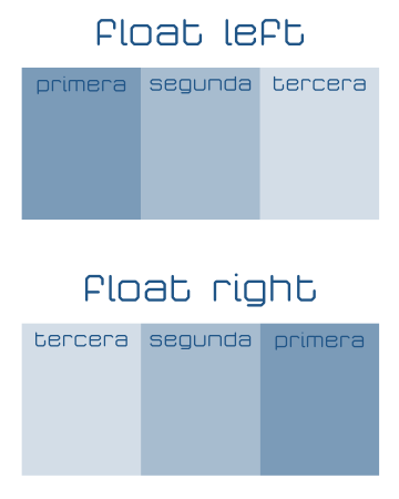
The rectangles (blocks) that we have defined with elements <div>, they are placed one under the other by default. To change this behavior you can use the property float, Indicating left o right as a value, so that they flow from left to right or from right to left respectively. On the contrary, to prevent one object from "floating" to the right or left of another, you can use the property clear with the values left, right o both, which override the flow from left to right, right to left, or both.

Contrary to what happens in other circumstances, the flow produced float does not automatically modify the dimensions of the container, so it is useful to include in its properties overflow:auto; to force the size (height) of the container to change when an object overflows it due to its location with float.
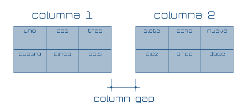
Another way to configure the flow of an element's content is to divide it into columns with the property column-count (which for the moment should be accompanied by -webkit-column-count and -moz-column-count) The size of the columns can be indicated (actually suggested) with column-width (-webkit-column-width -moz-column-width) and the separation between columns with column-gap (-webkit-column-gap -moz-column-gap)
So that the blocks are not divided and their content is distributed over several columns, you can use display:inline-block; although that surely implies. leave a part of the column unused.
SEO
To establish the location of the elements on the web page, CSS uses several positioning modes that can be different for each element, that is, it is possible to mix different positioning criteria on the same website.
-
position:static;It is the default positioning (it is not necessary to indicate it if it has not been previously modified). This type of positioning follows the "natural" flow of the page: one element after another starting from the left, growing, as long as there is space, to the right and from top to bottom. It does not use horizontal or vertical coordinates to establish its location, it follows the position that corresponds to the order of the object. -
position:fixed;It is used to place an object in a fixed position in the browser window (like a menu, for example). The location of the element is specified horizontally withleftorightto determine the separation on the left or right respectively and withtopobottomfor separation above or below the edge of the browser window (viewport).Using this and other types of positioning, objects can overlap. Objects drawn first (defined earlier in the code HTML) can be covered by those drawn later (those included later in the code HTML). To alter the normal order you can use the property
z-index, the objects with the highest value inz-indexThey cover those with less value. -
position:relative;Moves the element from its "normal" position as indicated by the propertiesleftorighthorizontally andtopobottomvertically. -
position:absolute;Places the element in a fixed position with respect to the object that contains it. Its location is expressed, as in previous cases, withleft,right,topybottomThe name of this type of positioning is confusing at first, since the position is established with respect to the object hierarchically superior to the one that uses the property, which is debatable whether it is absolute.
It is also important to remember that the element that contains the objects
<div>that we use at the first hierarchical level is<body>, therefore, if the<div>what do you useposition:absolute;is not contained in another, its positioning will be "absolute" with respect to the web page.
Properties for specific media and characteristics (media queries)
CSS allows you to define in the same style sheet different appearances for various media or supports depending on the type of device used (such as a screen, or a printer), its dimensions, its orientation (vertical or landscape) or its resolution. This serves to be able to display, in the most appropriate way for a context, the same web page.
To refer to the media, use @media in a similar way to what has already been explained for fonts with @font-face, enclosing in braces ({ y }) the definitions of the different elements: labels HTML, classes, identifiers...
The types of media available in CSS3 are: all, to refer to any media (all), screen for any type of screen (older versions of CSS They distinguished between TV and computer monitors) print for printer output and speech for audio web readers that interpret information with voice synthesizers.
| 1 2 3 4 5 6 7 8 9 10 11 12 13 14 15 16 17 | @media screen { .texto { color:#FFFFFF; background-color:#000000; } } @media print { .texto { color:#000000; background-color:#FFFFFF; } } |
In the example above, elements of the text class have a black background and white text on the screen but are printed with a white background and black text.
Conditions can be imposed on media to define different sets of properties based on, for example, the available resolution or viewport ratio. These conditions and the means themselves can be composed with logical operations and, not y only to demand that you comply with several, that you do not comply or only when you comply, respectively.
Among the available conditions, we find them especially interesting max-width (maximum window width), max-height (maximum window height), min-width (minimum window width), min-height (minimum window height), orientation (the orientation, which can be landscape, landscape, or portrait, vertical), max-resolution (maximum resolution in dpi, dots per inch, or in dpcm, points per centimeter) and min-resolution (minimum resolution, also in dpi o dpcm).
| 1 2 3 4 5 6 7 8 9 10 11 12 13 14 15 16 17 18 19 20 21 22 23 24 25 26 27 28 29 30 31 32 33 | @media all { .bloque_principal { background-color:#CCCCCC; } } @media screen and (min-width:320px) { .bloque_principal { width:300px; margin-left:auto; margin-rigth:auto; } } @media screen and (min-width:640px) { .bloque_principal { width:620px; } } @media print { .bloque_principal { background-color:#FFFFFF; } } |
In the previous example, we start by defining a background color so that, in all media, the elements of the main_block class have the background color #CCCCCC. When displayed on a screen and the window is at least 320 pixels wide, the left and right margin will be automatic (center the block) and the element width will be 300 pixels. If the screen resolution is 640 pixels, the block width will be 620 pixels. Since the second media definition does not include margin information and devices that meet the second condition will also meet the first, the horizontal margin will still be automatic.
Finally, in the example the background color is changed so that it is white in the printout.
The usual way of defining styles for different media is usually to start with the common ones, usually colors and fonts, followed by the most restrictive geometries (the measurements of devices with the lowest number of pixels) usually for smartphones and tablets where, in addition It will be important to know if they are used vertically or horizontally with orientation and surely also its resolution with min-resolution. Then the different sizes for larger screens are indicated, and it usually ends with printing and voice media, which in the example of IoT graphics have been omitted.
Use @media Imposing conditions such as dimensions, resolution and orientation allows the designer to create a single web page that, with different styles, will look the most appropriate for each device. This behavior is usually called responsive design; adaptable design, in a very free translation.
CSS for SVG graphics container
With what has been explained so far, it is now possible to define the styles that the SVG graphics HTML container with which to represent the state of the sensors connected to the IoT. In the following code is the proposal including, commented, the distribution in columns that corresponds to a greater number of graphs than those that the proposal of the series of articles uses, so that it can be reused in other cases.
| 1 2 3 4 5 6 7 8 9 10 11 12 13 14 15 16 17 18 19 20 21 22 23 24 25 26 27 28 29 30 31 32 33 34 35 36 37 38 39 40 41 42 43 44 45 46 47 48 49 50 51 52 53 54 55 56 57 58 59 60 61 62 63 64 65 66 67 68 69 70 71 72 73 74 75 76 77 78 79 80 81 82 83 84 85 86 87 88 89 90 91 92 93 94 95 96 97 98 99 100 101 102 103 104 105 106 107 108 109 110 111 112 113 114 115 116 117 118 119 120 121 122 123 124 125 126 127 128 129 130 131 132 133 134 135 136 137 138 139 140 141 142 143 144 145 146 147 148 149 150 151 152 153 154 155 156 157 158 159 160 161 162 163 164 165 166 167 168 169 170 171 172 173 174 175 176 177 178 179 180 181 182 183 184 185 186 187 188 189 190 191 192 193 194 195 196 197 198 199 200 201 202 203 204 205 206 207 208 209 210 211 212 213 214 215 216 217 218 219 220 221 222 223 224 225 226 227 228 229 230 231 232 233 234 235 236 237 238 239 240 241 242 243 244 245 246 247 248 249 250 251 252 253 254 255 256 257 258 259 260 261 262 263 264 265 266 267 268 269 270 271 272 273 274 275 276 277 278 279 280 281 282 283 284 285 286 | @font-face /* Descripción del tipo de letra ancho */ { font-family:“SircuitoExpandedLight”;/* Nombre de la tipografía */ /* Documentos con la tipografía en los formatos disponibles */ src: url(‘tipos/Sircuito-Expanded-Light.eot’); src: url(‘tipos/Sircuito-Expanded-Light.eot?iefix’) format(‘eot’), url(‘tipos/Sircuito-Expanded-Light.woff’) format(‘woff’), url(‘tipos/Sircuito-Expanded-Light.ttf’) format(‘truetype’), url(‘tipos/Sircuito-Expanded-Light.svg#webfont’) format(‘svg’); /* Forzar alisado de la tipografía (Normalmente por defecto) */ -webkit-font-smoothing:antialiased; } @font-face /* Descripción del tipo de letra normal */ { font-family:“SircuitoRegularLight”; /* Nombre de la tipografía */ /* Documentos con la tipografía en los formatos disponibles */ src: url(‘tipos/Sircuito-Regular-Light.eot’); src: url(‘tipos/Sircuito-Regular-Light.eot?iefix’) format(‘eot’), url(‘tipos/Sircuito-Regular-Light.woff’) format(‘woff’), url(‘tipos/Sircuito-Regular-Light.ttf’) format(‘truetype’), url(‘tipos/Sircuito-Regular-Light.svg#webfont’) format(‘svg’); /* Forzar alisado de la tipografía (Normalmente por defecto) */ -webkit-font-smoothing:antialiased; } @font-face /* Descripción del tipo de letra comprimido */ { font-family:“SircuitoCondensedLight”; /* Nombre de la tipografía */ /* Documentos con la tipografía en los formatos disponibles */ src: url(‘tipos/Sircuito-Condensed-Light.eot’); src: url(‘tipos/Sircuito-Condensed-Light.eot?iefix’) format(‘eot’), url(‘tipos/Sircuito-Condensed-Light.woff’) format(‘woff’), url(‘tipos/Sircuito-Condensed-Light.ttf’) format(‘truetype’), url(‘tipos/Sircuito-Condensed-Light.svg#webfont’) format(‘svg’); /* Forzar alisado de la tipografía (Normalmente por defecto) */ -webkit-font-smoothing:antialiased; } @font-face /* Descripción del tipo de letra normal de grosor normal */ { font-family:“SircuitoRegularMedium”; /* Nombre de la tipografía */ /* Documentos con la tipografía en los formatos disponibles */ src: url(‘tipos/Sircuito-Regular-Medium.eot’); src: url(‘tipos/Sircuito-Regular-Medium.eot?iefix’) format(‘eot’), url(‘tipos/Sircuito-Regular-Medium.woff’) format(‘woff’), url(‘tipos/Sircuito-Regular-Medium.ttf’) format(‘truetype’), url(‘tipos/Sircuito-Regular-Medium.svg#webfont’) format(‘svg’); /* Forzar alisado de la tipografía (Normalmente por defecto) */ -webkit-font-smoothing:antialiased; } @media all { body { font-family:“SircuitoCondensedLight”; margin:0px; column-count:1; -webkit-column-count:1; /* Viejos Chrome, Opera y Safari */ -moz-column-count:1; /* Viejos Firefox */ column-gap:8px; -webkit-column-gap:8px; -moz-column-gap:8px; background-color:#FFFFFF; } .bloque_sensor, .bloque_titulo, .bloque_descripcion, .bloque_fecha, .bloque_grafico { display:inline-block; box-sizing:border-box; width:100%; color:#205587; } .bloque_sensor { min-width:320px; height:100%; background-color:#EDEDED; } .bloque_titulo { padding:16px 16px 0px 20px; font-size:25px; } .bloque_descripcion { padding:2px 16px 0px 20px; font-size:15px; } .bloque_fecha { padding:2px 16px 8px 20px; font-size:17px; } .bloque_grafico { height:200px; padding:4px 20px 20px 20px; } .grafico { background-color:#A8C3EA; } } @media (min-width:360px) { body { margin:8px 8px 0px 8px; } .bloque_sensor { margin:0px 0px 8px 0px; background-color:#E9E9E9; } } @media (min-width:460px) { body { font-family:“SircuitoRegularLight”; } } @media (min-width:530px) { body { font-family:“SircuitoExpandedLight”; } } @media (min-width:690px) { body { font-family:“SircuitoCondensedLight”; column-count:2; -webkit-column-count:2; /* Viejos Chrome, Opera y Safari */ -moz-column-count:2; /* Viejos Firefox */ } } @media (min-width:870px) { body { font-family:“SircuitoRegularLight”; } } @media (min-width:1010px) { body { font-family:“SircuitoExpandedLight”; } } /* @media (min-width:1020px) { body { font-family:”SircuitoCondensedLight”; column-count:3; -webkit-column-count:3; -moz-column-count:3; } } @media (min-width:1280px) { body { font-family:”SircuitoRegularLight”; } } @media (min-width:1570px) { body { font-family:”SircuitoExpandedLight”; } } */ @media (min-width:1610px) { body { font-family:“SircuitoCondensedLight”; column-count:4; -webkit-column-count:4; /* Viejos Chrome, Opera y Safari */ -moz-column-count:4; /* Viejos Firefox */ } } @media (min-width:1710px) { body { font-family:“SircuitoRegularLight”; } } @media (min-width:2010px) { body { font-family:“SircuitoExpandedLight”; } } /* @media (min-width:2200px) { body { font-family:”SircuitoRegularLight”; column-count:5; -webkit-column-count:5; -moz-column-count:5; } } @media (min-width:2520px) { body { font-family:”SircuitoExpandedLight”; } } */ |
Below you can see what these styles would look like. HTML code from proposed container for SVG graphics from the previous article.
The next article in this series explains how to draw with SVG Data graphs of the status of sensors connected to the Internet of Things (IoT).


Post Comment